
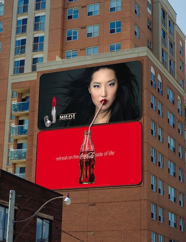
Out-of-Home Ads
Out-of-Home
We design Christchurch websites that look like your business rather than a template, and that guide visitors to the one action you actually want. Wireframes and a clickable prototype before anything gets built.
Quick Answer
This page is about design. If you are here for the build — platform choice, integrations, hosting, maintenance — our Christchurch website development page covers that side and the two usually run together on the same project. The split matters because they fail differently. A badly engineered site is slow and breaks. A badly designed site works perfectly and still loses the enquiry, because the visitor could not tell what you do, could not find the proof they needed, or hit a form asking for eleven fields when they only wanted a price. Design work is about the second failure, and it is the one most businesses cannot diagnose from the inside.
Years in NZ
In Business Since
Team
Based In
Our Web Design Agency Services in Christchurch
Analytics, session data, and interviews with your sales team. The objections they answer every week become the content hierarchy of the site.
Structure argued out in greyscale where changes are cheap. You click through the real journeys before any visual design is signed off.
Type, colour, photography direction and layout built for your business. Original design, and we will say plainly when a well-chosen theme is the smarter spend.
One clear action per page, forms cut to the essential fields, tappable phone numbers, proof placed beside the decision it supports.
Contrast checked at palette stage, designed focus states, readable type, labelled forms and useful error messages — decided during design, not patched after launch.
Figma file, component library and design tokens handed over with usage rules for edge cases. Any competent developer can build from it.
Selected Work
Out-of-Home Ads
Out-of-Home
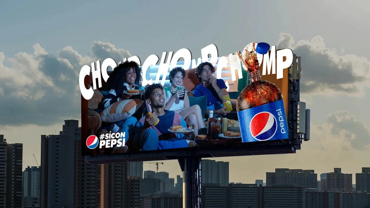
Outdoor Campaign
Outdoor Campaign
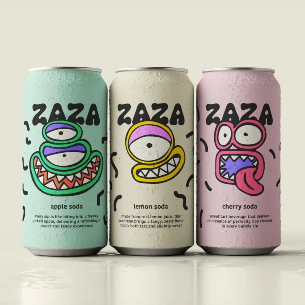
Brand Identity
Brand System
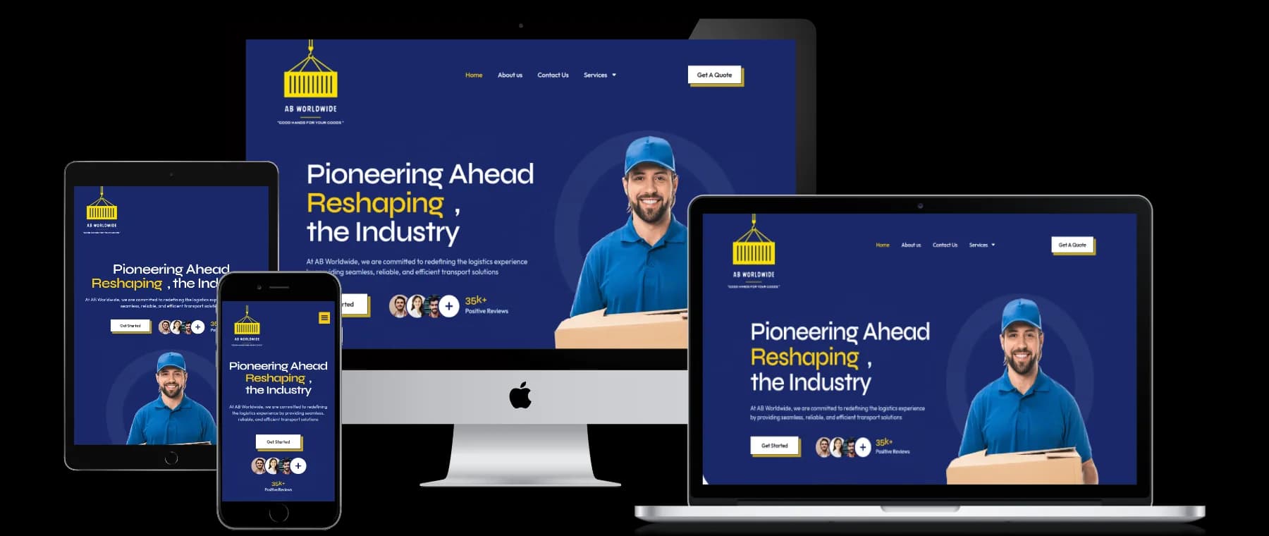
Web Development
Multi-Device Web
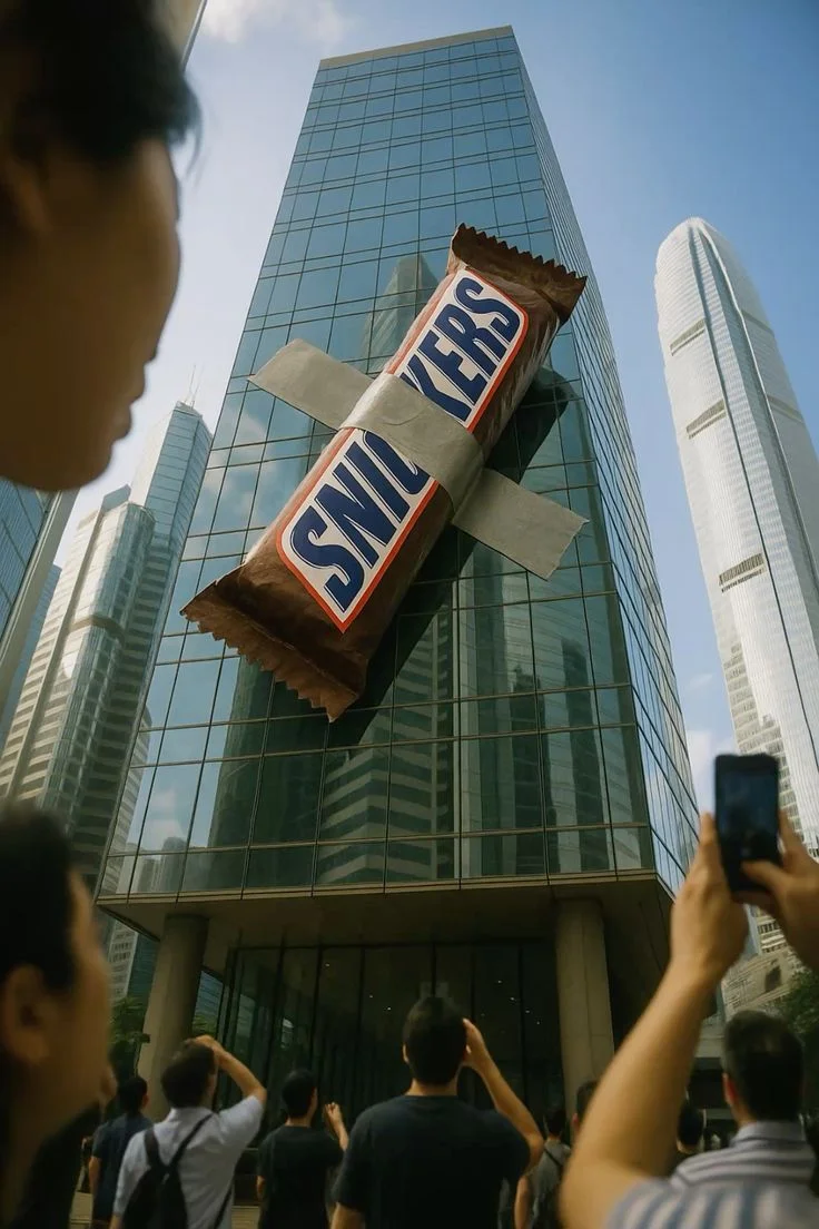
Guerilla Marketing
Guerilla Concept
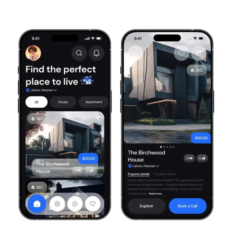
UX / UI Design
PropTech App

Social & Creative
Fitness Creative
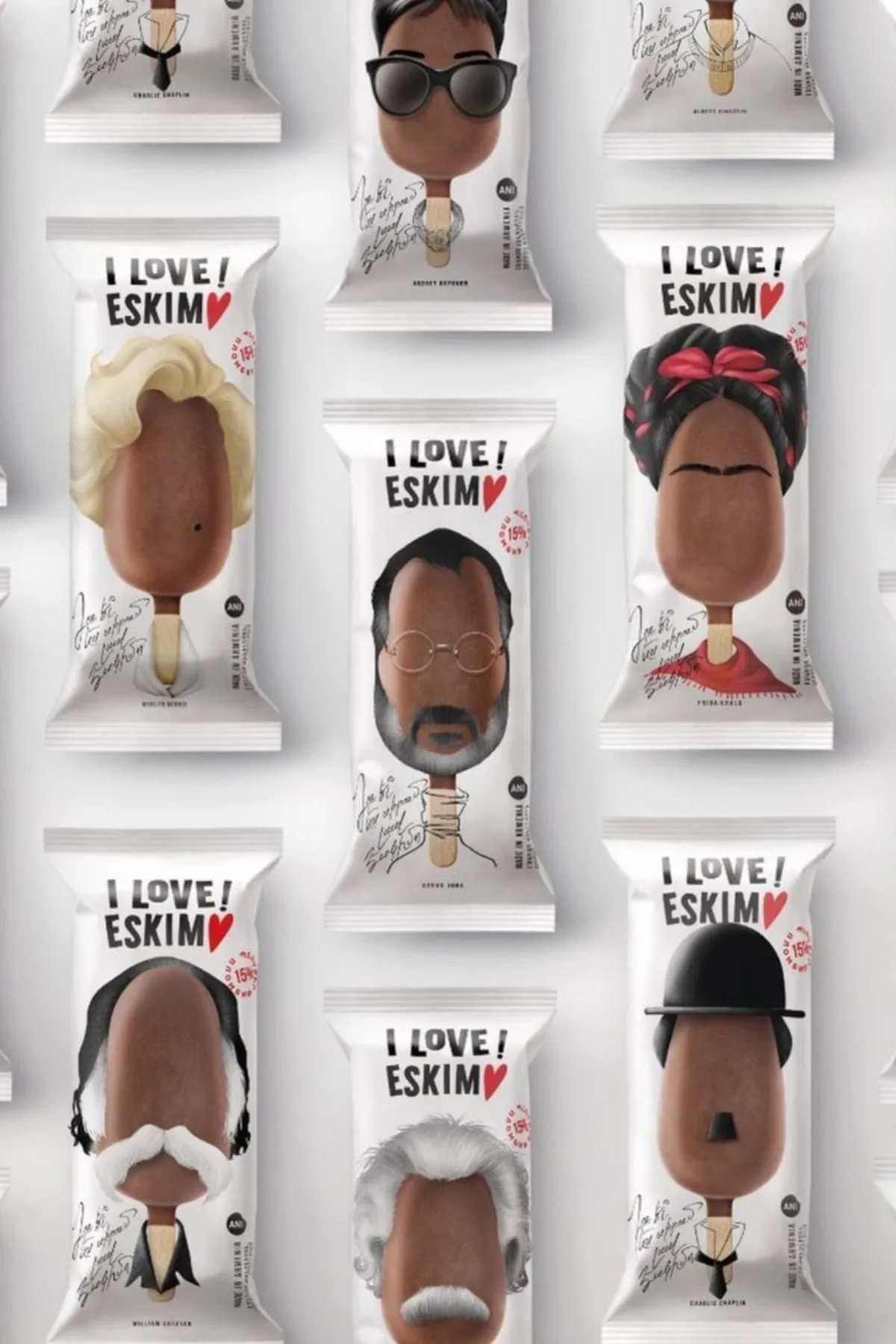
Packaging Design
Packaging Design
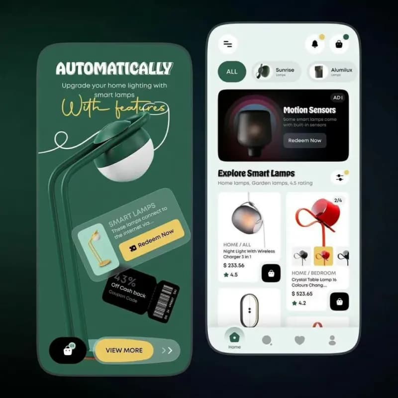
Mobile UX
Smart Home App
Print Advertising
Print Advertising

The first stage is evidence, not opinion. We read your analytics and Search Console data to see which pages people actually land on, watch session recordings if you have them, and interview two or three of your salespeople — the people who hear the same three objections every week. Those objections belong on the page. We also review the Christchurch competitors ranking for your terms, less to copy them than to find the thing everyone in the category says identically, so you can say something else.
Then structure. Sitemap, page-by-page wireframes in greyscale, and a content brief for each template describing what has to be on it and why. We prototype the key journeys — enquiry, quote request, product find, careers — and click through them with you. Changing a wireframe takes minutes. Changing the same idea after it is designed, built and populated takes days, which is exactly why so many sites launch with structural problems nobody wanted to reopen.
Visual design follows, delivered as a system rather than a set of pictures. Type scale, colour with contrast ratios checked, spacing, buttons and their states, form fields, cards, tables, error and empty states. We design the awkward cases on purpose: the long product name, the three-line heading, the case study with no photo, the mobile view of a data table. Two structured feedback rounds, consolidated so you are not chasing your own team for comments. Then a documented handover to whoever builds it, us or otherwise.
Design-led projects are priced on how many templates have to be designed and how many distinct audiences the site has to serve. A focused site with custom design across the key page types is the entry point. A full design system with multiple templates and a considered conversion path per audience costs roughly twice that, because each audience path is effectively a second site to design. Standalone work — a UX audit with prioritised fixes, a conversion review of an existing site, or a design system for a team that already has developers — is the cheapest way in, since there is no build attached. Every engagement ships you the Figma file, the component library and the design tokens. You own them, and any competent developer can build from them.

Conversion design is mostly subtraction. One primary action per page, stated in the visitor's language rather than yours. Forms cut to the fields you genuinely need to start a conversation — name, contact, suburb, job type will do; the rest can wait for the phone call. Phone numbers tappable and visible on mobile without scrolling, because a large share of Canterbury trade and service enquiries arrive as calls, not form fills. Proof placed next to the decision it supports rather than quarantined on a testimonials page nobody visits.
Accessibility is treated as design work, not a compliance checkbox bolted on at the end. We check colour contrast at the palette stage rather than discovering at launch that the brand's mid-grey fails on white. Focus states are designed, not left to the browser default. Type sizes and line lengths are set for comfortable reading on a phone. Forms get real labels, sensible tab order and error messages that say what to fix. The practical payoff is broad: the same choices that help a screen-reader user help anyone reading in bright sun on a Canterbury worksite.
We also design for how the page is maintained. A layout that only looks right with exactly four services and a perfect 16:9 photo will be broken within a month of your team using it. So components are specified with rules — what happens with two items, what happens with nine, what happens when the image is portrait. That, plus the documented design system, is what keeps a site looking deliberate two years after launch instead of gradually turning into a patchwork.
Why Choose Us
We start with the decision your visitor is trying to make, not with a moodboard. For a Christchurch business that usually means three or four distinct audiences arriving with different questions: a homeowner comparing three quotes, a procurement manager checking whether you can handle the volume, a job applicant, and an existing client looking for a phone number. Good design gives each of them an obvious first move within a few seconds of landing. That resolves into an information architecture and a set of wireframes, which is where the real arguments happen — cheaply, in grey boxes, before anyone has fallen in love with a colour.
Analytics, session data, and interviews with your sales team. The objections they answer every week become the content hierarchy of the site.
Structure argued out in greyscale where changes are cheap. You click through the real journeys before any visual design is signed off.
Type, colour, photography direction and layout built for your business. Original design, and we will say plainly when a well-chosen theme is the smarter spend.
One clear action per page, forms cut to the essential fields, tappable phone numbers, proof placed beside the decision it supports.
Contrast checked at palette stage, designed focus states, readable type, labelled forms and useful error messages — decided during design, not patched after launch.
Figma file, component library and design tokens handed over with usage rules for edge cases. Any competent developer can build from it.
Industries
Kiwitech works with Christchurch and wider New Zealand businesses across 25+ industries, but four verticals dominate our roster: property, education, healthcare, and food and beverage. SaaS, D2C retail, e-commerce, and industrial manufacturers round out the next tier of growing accounts.
02/Awards & partnerships

Top GenAI Company
Clutch · 2026 leader
Google Ads
Search, Shopping & Performance Max

Top Clutch · App Dev
Verified industry leader
Microsoft
Advertising & cloud
Shopify
Commerce builds
WordPress
CMS & enterprise web
ChatGPT
AI workflow partner
Gemini
Google AI partner
Google Cloud
Infra & data
Bing Ads
Microsoft advertising
Our Process
A 5-step playbook we run with every Christchurch client. Same rigour for a single-location SMB and a multi-brand enterprise pod — only the depth changes.
Analytics and Search Console review, sales team interviews, competitor teardown across the Christchurch businesses ranking for your terms.
Sitemap, greyscale wireframes for every template, and a content brief per page. Signed off before any visual work starts.
Clickable prototype of the key journeys — enquiry, quote, product find, careers — tested on a phone as well as a desktop.
Type scale, colour with contrast ratios, spacing, components and states, including the awkward cases. Two consolidated feedback rounds.
Documented Figma file, tokens and component rules, plus a walkthrough with whoever builds it. We build it too if you want the pair kept together.

Brand expression is the next layer, and Christchurch has a specific texture worth designing to rather than around. A city that rebuilt its centre inside fifteen years reads confidence differently: the local visual language leans practical, materials-honest, and quietly proud rather than glossy. Businesses in Addington, Riccarton or Papanui competing against national chains win on being visibly local and visibly competent. That comes through in real photography of real jobs and real staff, in typography with some backbone, and in restraint — a palette of two or three colours used consistently beats a rainbow every time.
FAQ
Template count and audience count set it. A focused site with custom design across the key page types is the entry point. A full design system with multiple templates and a separate conversion path per audience costs substantially more, because each audience path is effectively another site to design. Standalone work — a UX audit, a conversion review, or a design system for a team that already has developers — is the cheapest engagement, since no build is attached. Build costs are separate and quoted alongside.
This page is the design half — user experience, information architecture, brand expression, conversion and accessibility, delivered as wireframes and a design system. The Christchurch web development page is the engineering half: platform choice, integrations, hosting, performance and maintenance. Most projects use both, and they are quoted as separate lines so you can see what you are paying for.
Yes, and it is a common arrangement when a business has an in-house developer or an existing agency doing the engineering. You get the Figma file, the component library, the tokens and written rules for edge cases, plus a handover session with the build team so nothing is guessed at.
Three to five weeks for a focused site, six to nine for a larger design system with multiple templates. The gating factor is usually feedback rounds and content decisions rather than design hours, so we consolidate feedback into two structured rounds and set the dates at kickoff.
Usually yes, and it changes the result more than any other single factor. Real photos of your team, your site work and your premises beat stock images by a wide margin for a Christchurch business competing on being visibly local. Budget for a local photographer for half a day or so; we brief the shot list so you get images that fit the layouts rather than a folder you cannot use.
That is designed for. Components are specified with rules for two items or nine, portrait images or landscape, short headings or long — so the layout holds up when your staff add a project or a service. The design system documents those rules so edits do not slowly turn a considered site into a patchwork.
Get a Quote
Tell us about your goals — we'll reply within one New Zealand business day with next steps.
Tell us where Web Design sits for you today and what you need it to do. We'll come back with what we would change first, in what order, and what that involves.

Talk to a strategist
Free 30-minute call. No obligations. Just answers.